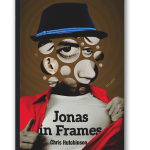
Click on the thumbnails to see how book designer Chris Tompkins combined photography and illustration to convey the off-kilter world of Chris Hutchinson’s Jonas in Frames (Goose Lane Editions).
-
- 100613
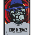
- <B>1.</B> <I>Jonas in Frames</I> jumps through space, time, and fractured realities, so I made sure to map out my ideas and develop a clear direction for where I wanted to go. The main concept was to show the protagonist’s face broken up into various pieces and put back together so they didn’t make perfect sense. The book is a hybrid of fiction and poetry, so early on I decided to explore a combination of illustration and photography as a way of juxtaposing reality and non-reality.
- Chris Hutchinson’s Jonas in Frames
- https://stage.quillandquire.com/wp-content/uploads/2014/05/covertocover-01-may-150x150.png
- https://stage.quillandquire.com/wp-content/uploads/2014/05/covertocover-01-may.png
- https://stage.quillandquire.com/wp-content/uploads/2014/05/covertocover-01-may.png
- 600
- 896
- https://stage.quillandquire.com/book-culture/2014/05/23/cover-to-cover-chris-hutchinsons-jonas-in-frames/slide/covertocover-01-may/
- covertocover-01-may
- 0
- 0
-
- 100614
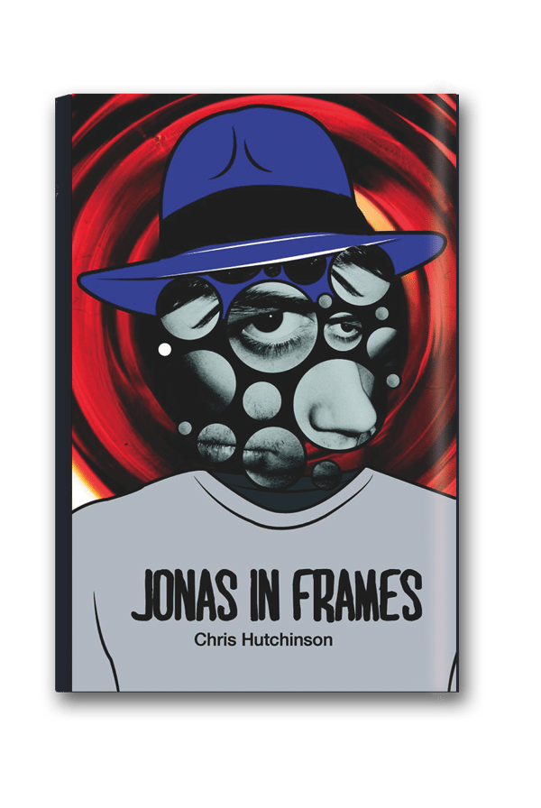
- <B>2.</B> After giving the first design some time to simmer, I felt the illustration route didn’t work as well as I had hoped, so I decided to ditch my illustrations for images that were similar. I also decided that, since Jonas is the hero, it would be an interesting touch to have him ripping open his shirt like Superman. Finally, I toned down the background.
- Chris Hutchinson’s Jonas in Frames
- https://stage.quillandquire.com/wp-content/uploads/2014/05/covertocover-02-may-150x150.png
- https://stage.quillandquire.com/wp-content/uploads/2014/05/covertocover-02-may.png
- https://stage.quillandquire.com/wp-content/uploads/2014/05/covertocover-02-may.png
- 600
- 896
- https://stage.quillandquire.com/book-culture/2014/05/23/cover-to-cover-chris-hutchinsons-jonas-in-frames/slide/covertocover-02-may/
- covertocover-02-may
- 0
- 0

-

- 100615
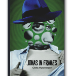
- <B>3.</B> The cover still felt like it was lacking something. I took a look at it with Goose Lane Editions creative director Julie Scriver, and we came to the conclusion that the colours were throwing us off. They felt too cool. I wasn’t sure what the right palette was going to be, so I played around with various options until I landed on something that felt right.
- Chris Hutchinson’s Jonas in Frames
- https://stage.quillandquire.com/wp-content/uploads/2014/05/covertocover-03-may-150x150.png
- https://stage.quillandquire.com/wp-content/uploads/2014/05/covertocover-03-may.png
- https://stage.quillandquire.com/wp-content/uploads/2014/05/covertocover-03-may.png
- 600
- 896
- https://stage.quillandquire.com/book-culture/2014/05/23/cover-to-cover-chris-hutchinsons-jonas-in-frames/slide/covertocover-03-may/
- covertocover-03-may
- 0
- 0
-
- 100616
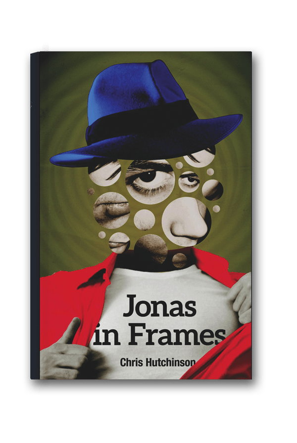
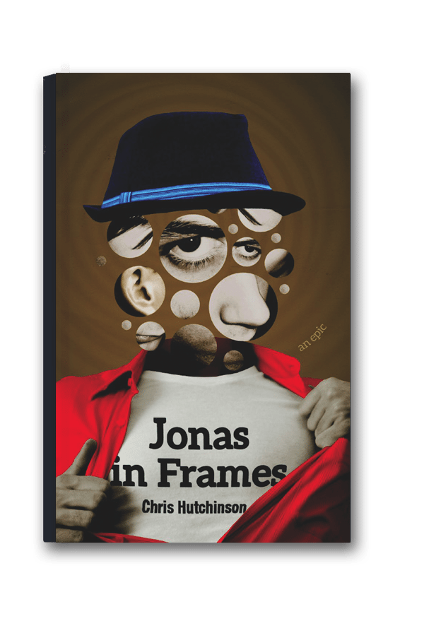
- <B>FINAL.</B> The next step was to send it off to the author for review. Chris Hutchinson’s enthusiastic reply was accompanied by a single suggested revision. He felt that, since the character was “a semi--reluctant hipster,” the style of the original fedora wasn’t the right choice, but should be more modern and trendy. Once I found the right hat, I integrated the title and author’s name into the shirt design, instead of just leaving them as floating type, and that pretty much wrapped it up.
- Chris Hutchinson’s Jonas in Frames
- https://stage.quillandquire.com/wp-content/uploads/2014/05/covertocover-04-may-150x150.png
- https://stage.quillandquire.com/wp-content/uploads/2014/05/covertocover-04-may.png
- https://stage.quillandquire.com/wp-content/uploads/2014/05/covertocover-04-may.png
- 600
- 896
- https://stage.quillandquire.com/book-culture/2014/05/23/cover-to-cover-chris-hutchinsons-jonas-in-frames/slide/covertocover-04-may/
- covertocover-04-may
- 0
- 0
From the May 2014 print edition
 Contact us via email